Berkshire Grey Website
Website Design
OnePlusOne Solutions provided a website redesign and high end illustrations for an AI and robotics company.

Berkshire Grey Website
OnePlusOne Solutions provided a website redesign and high end illustrations for an AI and robotics company.
About the Client
Berkshire Grey is a pioneer in transformative,AI-enabled robotic solutions to automate online order fulfillment and store replenishment operations for leading retail, eCommerce, grocery, 3PL, and package handling companies.
About the Project
Based on the client’s brand identity and requirements, our team has produced high-fidelity designs for the website’s pages that are up to modern standards. To accompany the new UX/UI, we have created a number ofisometric illustrations and animations that demonstrate the client’s products.

Project Overview
OnePlusOne Solutions worked with client Ankr to design and develop their corporate website and reinvent their brand with a fresh identity supported by isometric graphics, custom icons, and motion design. The project represents the ongoing relationship between OnePlusOne and Ankr, with the complex web project being a continuation of past projects that have included prior design and development work.
Leveraging our creative talent we were able to execute the brand optimization with new concepts and colors that would guide elements of the website UI design, while our UX experts got to work designing a functional and intuitive multi-page website. Once approved, our developers moved forward with the build, launch, and QA.

Project Overview
Mobe3 Live hired OnePlusOne Solutions as an external resource to redesign EVS’ main product, mobe3 WMS. This cloud-based warehouse management system was in need of fresh UX/UI designs and features that were on par with a similar mobile application project, mobe3 Live, that our company had recently completed for EVS.

Problem
Due to a quickly approaching launch date and a shortened timeline, our team immediately got to work on our UX/UI improvements, ideating and designing the features and functionalities, and improving existing app features.

Solution
Due to a quickly approaching launch date and a shortened timeline, our team immediately got to work on our UX/UI improvements, ideating and designing the features and functionalities, and improving existing app features.
User Experience
We implemented experimental motion animation on the starter screen, which fosters an illusion of the flight through the digital environment.
Our Process
Most of our projects begin with stakeholder interviews, and mobe3 Live was no exception. This essential part of our work process provides valuable insight into the needs and expectations of both our clients and the end users.
Segmentation
User Problems
User Solutions
Identifying User Personas
User Personas represent target users for the product that we were able to determine through interviews, research, and audits of user data. Our UX designers can then make informed design decisions and create compelling, user-friendly products tailored to the needs of specific user groups.
Creating Wireframes
We designed interaction schemes between pages and interface elements of the product. We create product models and mockups for testing and feedback from users. This allows us to better understand how the product will function and look, and make necessary changes before its final release.

UX Solutions
The UX assignment for mobe3 WMS included a number of UX/UI solutions that would greatly improve the way users interact with the application. Our key areas of focus for improving the application.
Navigation
Favorites Sidebar
Main Menu
Home Dashboard
Dataview Table & Filter Screens
Tasks
with UX Design
User Interface
We establish the initial visual direction with mood boards and design inspiration. Our main objective is to create a UI that aligns with Apple Human Interface Guidelines.
For this project we prioritized making the app look clean and intuitive, which was in line with the preferred direction of the client.

iOS-Based Design System
When working on a project’s UI design, we always start with a design system-the collection of reusable design components such as color schemes, typography, icons, graphics, and rules for using these components.
The approach of establishing a design system first, significantly speeds up the development process and reduces costs by allowing brand components to be standardized and readily used.


Project Conclusions
Our understanding of the needs and preferences of each user persona and our information architecture, were tools that informed us of opportunities for improvements and empowered us to make suggestions for new features and functionalities.


The improvements were translated directly through client KPIs and ROIs. As an example, mobe3 Live allowed users to respond 8 seconds faster to production line issues, which in turn saved the company $2,000,000 annually in revenue loss.
Our collaboration with EVS LLC didn't end here. After the successful app launch, we continued our relationship by working on the UX/UI revamp of their WMS product, and then signed on as a partner to create marketing materials for the company.

Project Overview
During and after our collaboration with EVS LLC on the mobe3 Live and mobe3 WMS redesign projects, OnePlusOne was brought on in another area of the business to assist the EVS marketing department by producing a range of graphic design deliverables. Our creative department was quickly onboarded to the project, and as we were already familiarized with brand guidelines and art styles, we were able to get started creating new content quickly and efficiently.
The engagement was ongoing, with OnePlusOne fulfilling the need for a variety of graphic design services throughout 2022.

Digital Art
Our deliverables for this graphic design project included 2D and 3D illustrations for use in user guides, marketing decks, advertisements, and across social media. Accuracy was vital, and our team needed to create technically accurate depictions of the devices and processes, as well as precise illustrations of warehouse managers and workers utilizing the products and technology.
Our deliverables for this graphic design project included 2D and 3D illustrations for use in user guides, marketing decks, advertisements, and across social media.
Accuracy was vital, and our team needed to create technically accurate depictions of the devices and processes, as well as precise illustrations of warehouse managers and workers utilizing the products and technology. Our team collaborated closely with the client to ensure that our designs of each of these elements were a faithful depiction.
Most of EVS LLC’s marketing documents rely heavily on the isometric perspective of a product which is one of our team’s specialty capabilities. Most of EVS LLC’s marketing documents rely heavily on the isometric perspective of a product which is one of our team’s specialty capabilities.
Our illustrations included various iPhone and iPad cases graded for different environments and user roles, barcode scanners, and wireless beacons. We ensured that the device illustrations were as precise as possible.
We created isometric graphics and digital prototypes of Estimotes, the rock-shaped Bluetooth beacons utilized by EVS to track high-value assets. We were able to artistically and accurately produce these graphics with their numerous facets with great success.


Our team collaborated closely with the client to ensure that our designs of each of these elements were a faithful depiction.
Most of EVS LLC’s marketing documents rely heavily on the isometric perspective of a product which is one of our team’s specialty capabilities.
Our illustrations included various iPhone and iPad cases graded for different environments and user roles, barcode scanners, and wireless beacons. We ensured that the device illustrations were as precise as possible.
We created isometric graphics and digital prototypes of Estimotes, the rock-shaped Bluetooth beacons utilized by EVS to track high-value assets. We were able to artistically and accurately produce these graphics with their numerous facets with great success.
Our final deliverables followed best practices in terms of design and structure, which were able to be easily passed on and repurposed for animation which our team tackled in the next phase of the project.

Motion Design
Some elements of the functionality mobe3 Live and mobe3 WMS offer were best represented with motion rather than a static image, so demonstrating them and their use cases with animation was our next step. Our team created videos that highlighted the key features and advantages of the products.
Advertising
Using designs from previous phases, we were able to produce several banner ads created with the goal of appealing to the clients’ target audience.

Project Conclusions
By the end of the engagement we had created a set of illustrations, animations, isometric graphics, digital 3D prototypes, and ad banners that were used by EVS LLC’s marketing team across a number of different channels.
The deliverables closely followed the brand guidelines and desired direction for the art, while also improving the existing visual style, offering better product representation. The final result was versatile, high-end content that highlighted the unique and innovative products, and elevated the presentation of both the brand and their technology.
The Product
Ankr provides a computation-resource-efficient blockchain and an integrated data feed system leveraging both cryptographic primitives and trusted hardware.
UX/UI Design
Isometric Graphics
Sophisticated and branded graphic components elevate many aspects of website design. We created from scratch eye-catchy informational and navigational elements, that draw the users’ attention in the right direction and help them manipulate the website information.


Roadmap Section
The roadmap timeline provides a glance into Ankr’s key milestones and accomplishments, and insight into the company trajectory. This section’s design was complimented by left-right navigation buttons that clearly and comprehensively laid out the highlighted information.

Custom Icons
We created custom icons for the Ankr corporate website that would compliment both the optimized brand identity and the UX/UI of the site. The icons supported the information on the page, and were designed to help communicate features of the product.
Motion Design
To enhance elements of the website our team produced premium motion graphics using the Ankr logo for inspiration. The design elements of sharp edges and meaningful geometry inspired us through our conceptualization of the value-adding motion graphics.
Following this we developed the visual effect of the consistent movement of geographical planes that resulted in elegant motion and smooth transitions.
Adaptive Design
With mobile us being a primary method of viewing websites, we always prioritize clean, adaptive design for optimized viewing on any screen size. The Ankr site will always load and display in a format that fits the device it is viewed on.


Project Overview
mobe3 Live is a breakthrough in Warehouse Management Systems (WMS) functioning as the world’s first application to use Apple Indoor Maps in an enterprise environment. The technology allows precise tracking of employee and asset positioning without the need for equipment installation. For this project, OnePlusOne worked to ensure that the app is not only user-friendly, but fully compliant with Apple Human Interface guidelines.
OnePlusOne was selected among several other design studios and specialists to create the final UX/UI designs for mobe3 Live prior to production.

Problem
The existing app designs were unrefined and unfit for release due to counterintuitive designs that made it difficult to navigate. UX standards for user behavior patterns were not adhered to, inhibiting accessibility and key functionalities.

Solution
We performed an initial analysis of the application, identified problems, and created new UX/UI designs that took the user pain points and heuristics into consideration. We suggested several important updates for expanding functionality, and updated the app’s visual style, layout, and design.
User Experience
One of the key areas of focus for our team was improving the overall user experience of the app by understanding how it is used and evaluating the current limitations impacting usability. This helped us determine the need for new and updated functionalities and developing the information architecture.
Our Process
Most of our projects begin with stakeholder interviews, and mobe3 Live was no exception. This essential part of our work process provides valuable insight into the needs and expectations of both our clients and the end users.
Segmentation
User Problems
User Solutions
Identifying User Personas
User Personas represent target users for the product that we were able to determine through interviews, research, and audits of user data. Our UX designers can then make informed design decisions and create compelling, user-friendly products tailored to the needs of specific user groups.
Information Architecture
This crucial step of building out the information architecture acts as a basis that grants us a precise understanding of how users will interact with the product, and steps we can take to improve overall user experience.
Creating Wireframes and Connections
We design the interaction schemes for all pages and interface elements of the product. Our process involves presenting and refining product mockups during client review, and adjusting according to client feedback and our knowledge of best practices.
User Interface
We establish the initial visual direction with mood boards and design inspiration. Our main objective is to create a UI that aligns with Apple Human Interface Guidelines.
For this project we prioritized making the app look clean and intuitive, which was in line with the preferred direction of the client.
iOS-Based Design System
When working on a project’s UI design, we always start with a design system-the collection of reusable design components such as color schemes, typography, icons, graphics, and rules for using these components.
The approach of establishing a design system first, significantly speeds up the development process and reduces costs by allowing brand components to be standardized and readily used.


Project Conclusions
Our UX/UI design for the mobe3 Live application greatly improved the user experience, accessibility, and functionality of the app.
The upgraded look and feel was on par with the Apple references provided by the client, and the app was prepared and finalized for on-time release.
The improvements were translated directly through client KPIs and ROIs. As an example, mobe3 Live allowed users to respond 8 seconds faster to production line issues, which in turn saved the company $2,000,000 annually in revenue loss.
Our collaboration with EVS LLC didn't end here. After the successful app launch, we continued our relationship by working on the UX/UI revamp of their WMS product, and then signed on as a partner to create marketing materials for the company.
Before/After

Motion Design
Desktop Pages
Home


Movement


Startup Kit


Dispatch


Contact


Adaptive Design


Before/After
Desktop Pages

Adaptive Design


Logo and Colors


Typography

Motion Design
We have also created the hazy green animation that would later be used as the website background.
Motion Design
Illustrations


Logo and Colors


Typography


Motion Design
Desktop Pages
Home


Desktop Pages
About Us


Desktop Pages
Careers


Desktop Pages
Team


Desktop Pages
Get in Touch


Adaptive Design


Desktop Pages
Sleeve Overview


Desktop Pages
Clients


Desktop Pages
Editing a Customization


Dark Theme
The main theme was light to follow the brand identity.
But we also created a dark theme as an alternative. It will improve visual ergonomics by reducing eye strain, adjusting brightness to current lighting conditions, and facilitating screen use in dark environments.

Billboard Video
There is a placeholder text.
Juneteenth Video Advertising
Motion Design
Storyboard of The Upcoming Video


Advertising Variations


Desktop Pages

Illustrations


Adaptive Design


Desktop Pages
Home


Search Results - map view


Search Results - list view


Asset View


Project Interest


Adaptive Design


Desktop Pages
Home


Contact Us


Become an Affiliate


Blog


Get a Quote


Adaptive Design


Desktop Pages
Sign In

Get Started

Dashboard

Sound Library

Post-registration

Work with Artificial Intelligence


Adaptive Design


Motion Design
Desktop Pages
Home

About Us

What We Do

Contact Us

Adaptive Design


Motion Design
Desktop Pages
Home


Our Mission

Products

Solutions

Custom Icons
Adaptive Design


Motion Design
UX Design
Desktop Pages
Home


Our Firm


Culture


Awwards


Portfolio


Custom Icons
Adaptive Design


Motion Design
Desktop Pages

Adaptive Design


Project Overview
Amen created a feature-rich website focused on the company’s tech products, according to “we are making cloud computing revolution, not just developing another app“ approach.
Our creative team worked their heart out in order to develop a unique concept:

The Product
Ankr develops infrastructure for deploying any blockchain node easy, accessible, affordable and instantly distributed across the globe.

UX/UI Design
Isometric Graphics
Algorithmic schemes made easy to take in. Subsequently, we included some isometric graphics to help website visitors easily perceive the savvy content. Block-schemes speak more than words.

Roadmap Section
Have a look at the convenient and efficient roadmap. No unnecessary details and nitty-gritty, only the main stuff.

Compact Team Section
Usually, team sections on websites are huge, heavy-footed and occupy a lot of space. We strived to make the team section compact, informative, and convenient. Presently, it serves as an attractor, not as a distractor.

Motion Design
We implemented experimental motion animation on the starter screen, which fosters an illusion of the flight through the digital environment.
This vides associates with the new birth, with the launch of the new era, and with an endless journey.

Adaptive Design
With the incredible popularity and the wide range of mobile devices, as designers, we need to adapt to the variety of screen sizes. From the gigantic corporate monitor to the smartwatch, everywhere Ankr website looks superb. Literally everywhere.


Project Overview
We developed UX/UI design for several projects: a dashboard, and an e-commerce. Our team creates the most user-friendly and intuitive interface that enhances the user experience. We also considered the Cad and the Dandy brand identity to ensure a consistent style and branding across all platforms. As a result of our work, the client received effective tools for managing their business and improving sales.

Problem
The request from Cad and the Dandy was to develop a modern, intuitive, and user-friendly an administrative panel for managing orders.

Solution
An administrative panel was developed, which allows for managing orders, adding new products, editing existing ones, and getting information about sales and customers.
User Experience
We implemented experimental motion animation on the starter screen, which fosters an illusion of the flight through the digital environment.
Identifying User Personas
Personas are fictional representations of target users, created based on research and user data. They help UX designers make informed design decisions and create effective, user-friendly products tailored to the needs of specific user groups.
Prototyping
We designed interaction schemes between pages and interface elements of the product. We create product models and mockups for testing and feedback from users. This allows us to better understand how the product will function and look, and make necessary changes before its final release.

with UX Design
User Interface
We began by establishing the visual direction with mood boards and design inspiration. Our main objective was to create a UI that was in line with the client's requirement to follow human interface guidelines.

Design System
A design system is a collection of reusable design components such as color schemes, typography, icons, graphics, and rules for using these components
It helps to speed up the development process and reduce costs by allowing for the reuse of ready-made components and templates.


Project Conclusions
Our understanding of the needs and preferences of each user persona and our information architecture, were tools that informed us of opportunities for improvements and empowered us to make suggestions for new features and functionalities.

The mobe3 Live functionality was expanded based on our recommendations, which improved the user experience with features that included:

Since the launch, both users and the client have reported their appreciation of the unprecedented visibility and ease of use the new app offers.
The improvements were translated directly through client KPIs and ROI. For example, mobe3 Live allowed users to respond 8 seconds faster to production line issues, which in turn saved the company $2,000,000 annually.

The Challenge
Create a completely unique Snoop Dogg game from concept to delivery, that could be built on existing mechanics, and successfully bring Snoop into the Roobet Universe by capturing his persona in an illustrative style.

The Solution
We presented Snoop’s Hotbox to the client, suggesting a crash-style game, where users bet on the length of Snoop’s drags from an earth-shattering blunt that takes users on a journey through a Snoop Dogg-themed universe.
Our Process
Designing the game began with conception followed by illustration, creating game assets, and animation. First we had to bring Snoop into the Roobet universe by capturing his unique image in an illustrative style that would set the theme for the rest of the design work.
Game Concepting
We evolved 'Crash' into a unique Snoop Dogg-themed experience, where bets are placed on the length of his blunt drags. Comprised of over 11 million pixels, numerous parallax backgrounds are populated with global landmarks and hidden easter eggs, adding layers of fun and replayability to Hotbox.

Creating Game Assets
Creating game assets involved designing and refining a UI kit of visual elements like buttons and icons, and using digital tools to ensure consistency with the game's theme. Our landscapes take players around a world of fun surprises as Snoop takes hits of his blunt.
Game Assets

World

Splash Screen

Animation
We added lots of playful animation to further enhance the experience. The game centers on Snoop Dogg’s "breaking news” providing entertaining updates while his remarkably long blunt encircles the globe. Capturing narrative and the crash game concept, we designed the gameplay to resemble a live news broadcast—complete with multiple camera angles and a scrolling ticker of headlines.
Designing for Mobile Compatibility


“I enjoyed the whole process of Snoopifying Crash and makin’ it the Snoop Dogg way. So, let’s roll, keep it positive, and have some fun!”
-Snoop Dogg
In collaboration with:

About the Client
Berkshire Grey is a pioneer in transformative,AI-enabled robotic solutions to automate online order fulfillment and store replenishment operations for leading retail, eCommerce, grocery, 3PL, and package handling companies.
About the Project
Based on the client’s brand identity and requirements, our team has produced high-fidelity designs for the website’s pages that are up to modern standards. To accompany the new UX/UI, we have created a number ofisometric illustrations and animations that demonstrate the client’s products.
Before/After
Key Results
The Challenge
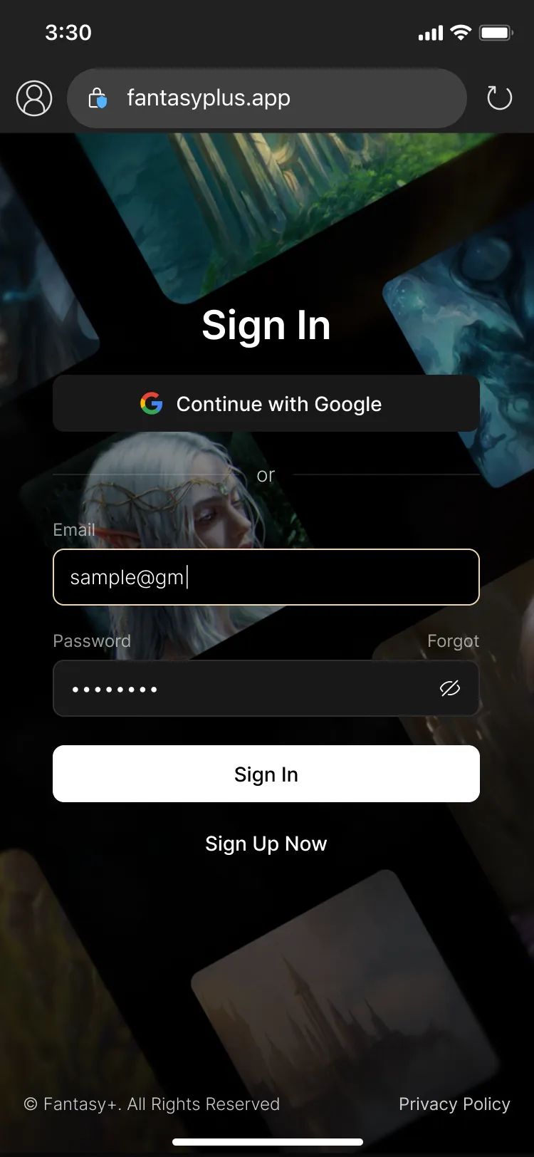
The original version of Fantasy+ served its purpose as a proof of concept—but under the hood, it struggled. Built without modern coding practices, it was slow, hard to scale, and lacked the essential tools for managing growing content and user demands. Monument Studios knew their product deserved more—something grander.
The Solution
OPO joined the project from the ground up, starting with early technical planning and requirements gathering ahead of the Kickstarter. We rebuilt the platform from scratch with a custom backend, intuitive content management system, and responsive, cinematic front-end that reflected the grandeur of the product. The result? A streaming platform as epic as the audio it delivers.
Our Process
Our collaborative approach ensured that technical challenges were met with innovative solutions, enabling rapid growth without sacrificing stability or usability.
Promo Animations
Adaptive Design
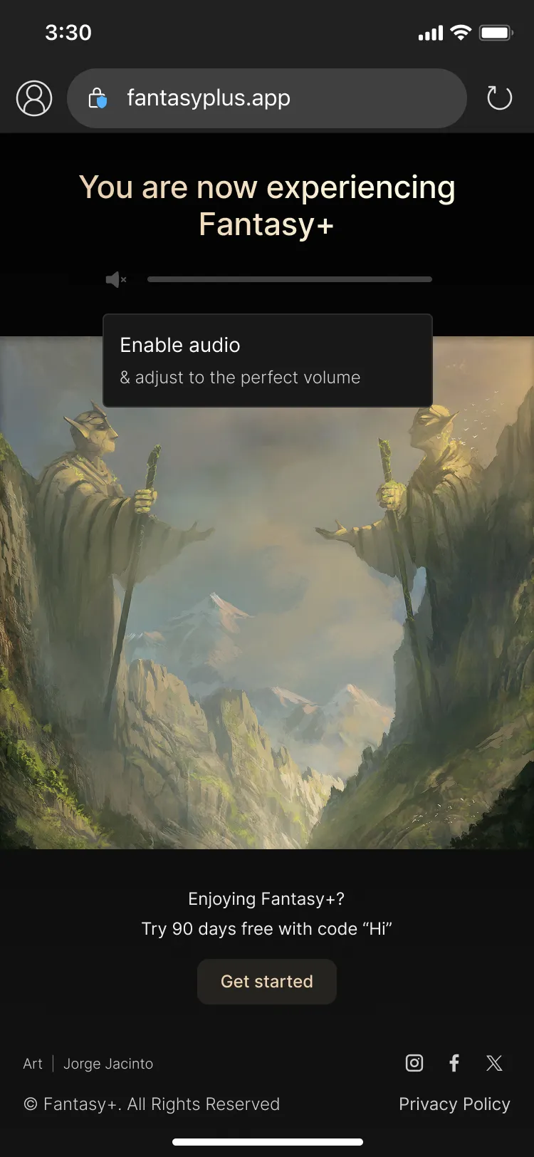
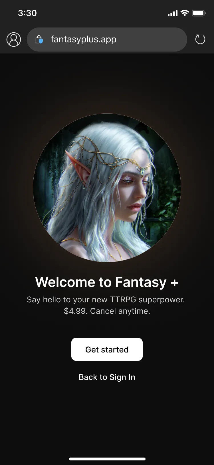
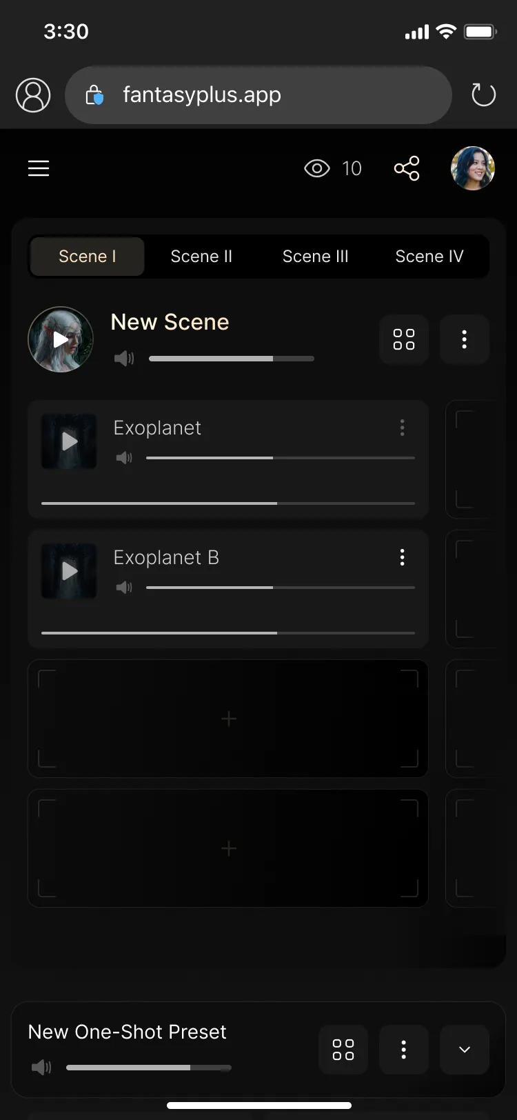
Project Conclusions
The result is a scalable platform that supports both current users and ambitious future features.
This project highlights how a strategic partnership and meticulous execution can elevate niche products to industry-leading standards—setting Fantasy+ apart as a benchmark for audio streaming in the gaming community.
“I enjoyed the whole process and making our idea live in such a short term. I am so happy with the result!”
Berkshire Grey

About the Client
Berkshire Grey is a pioneer in transformative,AI-enabled robotic solutions to automate online order fulfillment and store replenishment operations for leading retail, eCommerce, grocery, 3PL, and package handling companies.
About the Project
Based on the client’s brand identity and requirements, our team has produced high-fidelity designs for the website’s pages that are up to modern standards. To accompany the new UX/UI, we have created a number ofisometric illustrations and animations that demonstrate the client’s products.

The Challenge
The brand needed to speak to data professionals—many already working in tech—without feeling sterile or overly corporate. DataExpert had a unique voice: warm, direct, and slightly unconventional thanks to the inclusion of Lulu the dog as part of the founder’s personal brand. The identity had to balance that friendliness with authority, and work seamlessly across social platforms, learning interfaces, and marketing assets.

The Solution
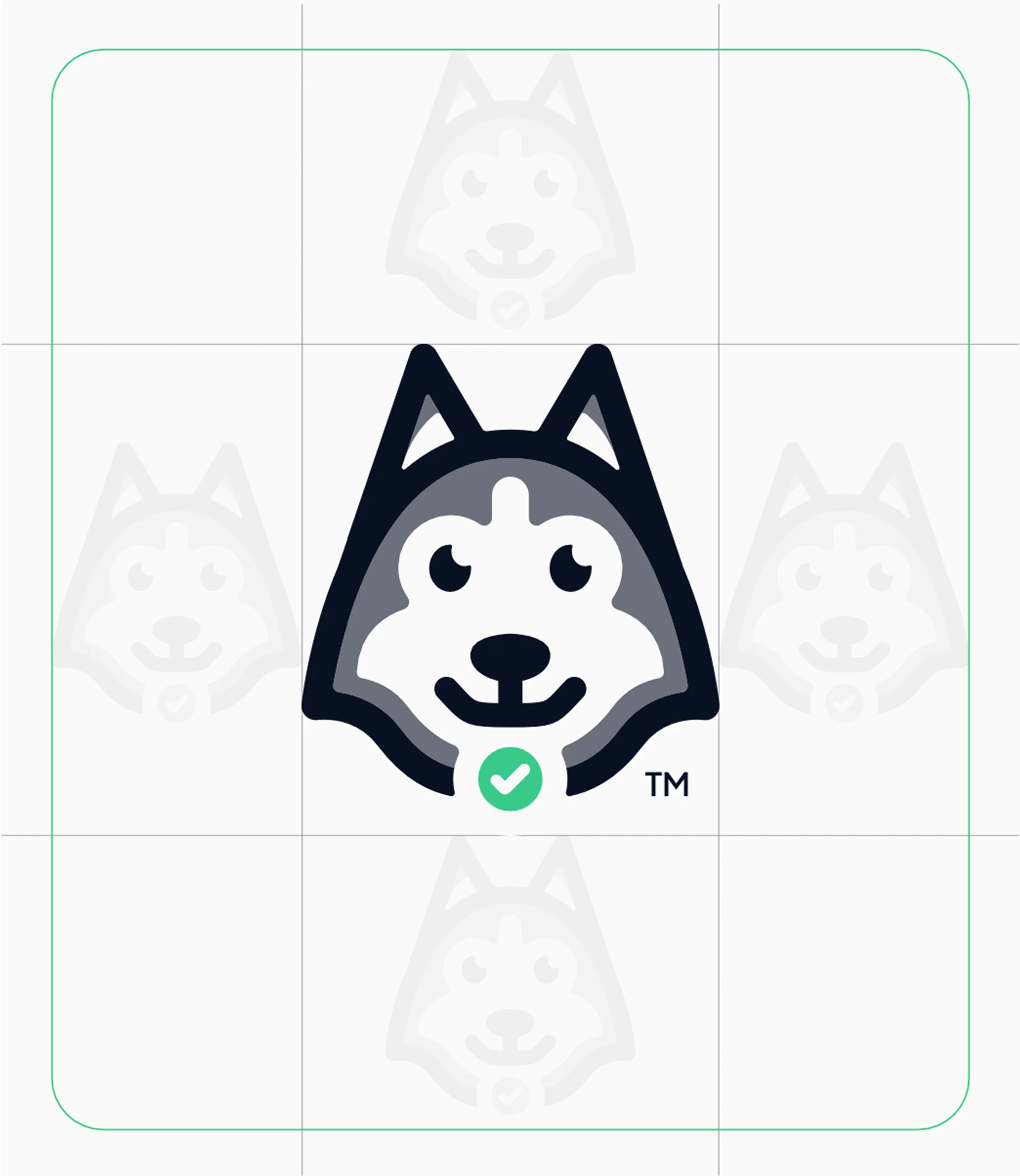
We leaned into the concept of mentorship and curiosity by building a visual system that’s intelligent, flexible, and personal. Lulu the dog became the face of the brand—a unique, emotionally resonant mascot that signals openness and approachability. The brand system we created emphasized legibility, contrast, and hierarchy, helping learners navigate complexity while feeling at ease.a flexible and scalable visual identity system, complete with the delivery of comprehensive brand guidelines.
Deliverables

Logo
We then created a modular logo system, including a primary lockup, standalone wordmark, and icon variants—all adaptable across different screen sizes and use cases. Alongside this, we defined a vibrant yet professional color palette with tones like Cyber Indigo, Nano Teal, and Byte Bone to reflect both technical focus and warmth. We paired these with a strong typographic foundation built on Plus Jakarta Sans, selected for its balance between friendliness and structure.


Typography
To support consistency and implementation, we built a full brand guideline document detailing usage rules, spacing systems, and accessibility considerations. This included a set of iconography rules (with options for light and dark themes), visual direction for social media assets (from Instagram highlights to YouTube banners), and downloadable components to support internal and external design teams.

Colors
The final output empowered the DataExpert team to scale their brand confidently and cohesively.
Favicon
Placeholder. The system ensures uniformity and cohesion across all platforms, and offers versatility for future expansions and additions to the platform.
Results & Impact
The refreshed identity gave DataExpert.io a clear, recognizable voice in a saturated edtech and career development market. Lulu became a community favorite, helping humanize the brand and drive engagement across social platforms. Internally, the brand toolkit streamlined onboarding for new contributors and helped unify marketing, course materials, and social presence under one cohesive umbrella.
About the Client
Berkshire Grey is a pioneer in transformative,AI-enabled robotic solutions to automate online order fulfillment and store replenishment operations for leading retail, eCommerce, grocery, 3PL, and package handling companies.
About the Project
Based on the client’s brand identity and requirements, our team has produced high-fidelity designs for the website’s pages that are up to modern standards. To accompany the new UX/UI, we have created a number ofisometric illustrations and animations that demonstrate the client’s products.
The Challenge
Launching in a noisy, highly technical space like Web3, Tokened needed to feel instantly clear and credible while standing out visually. The identity had to engage crypto newcomers without alienating more experienced users—and it had to scale.

The Solution
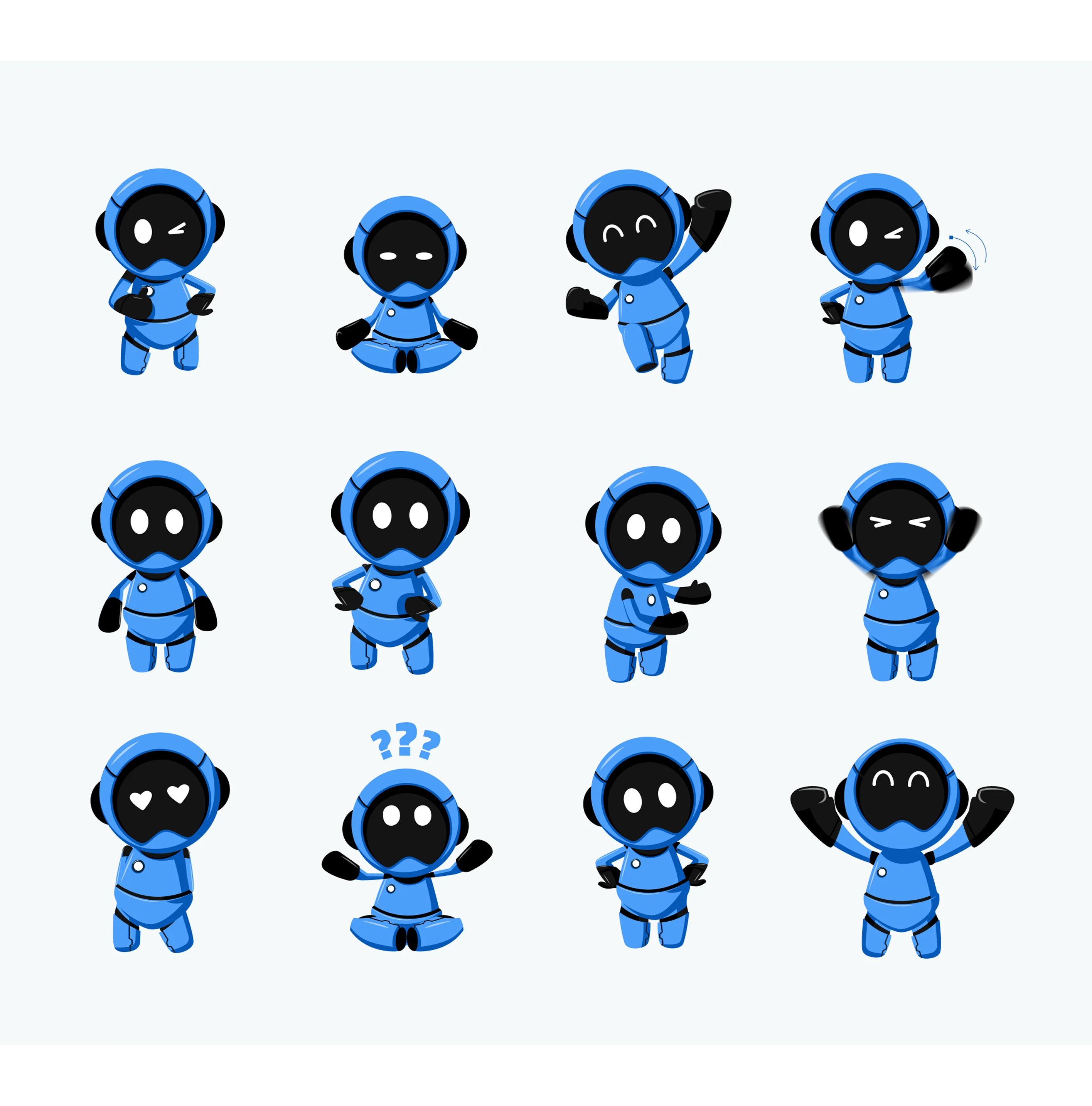
We developed a mascot-led, character-driven brand system rooted in access, fun, and flexibility. From strategy to execution, every element was crafted to support Tokened’s values and usability—from its primary logo and colors to custom illustrations and Figma-based UI components.
Deliverables
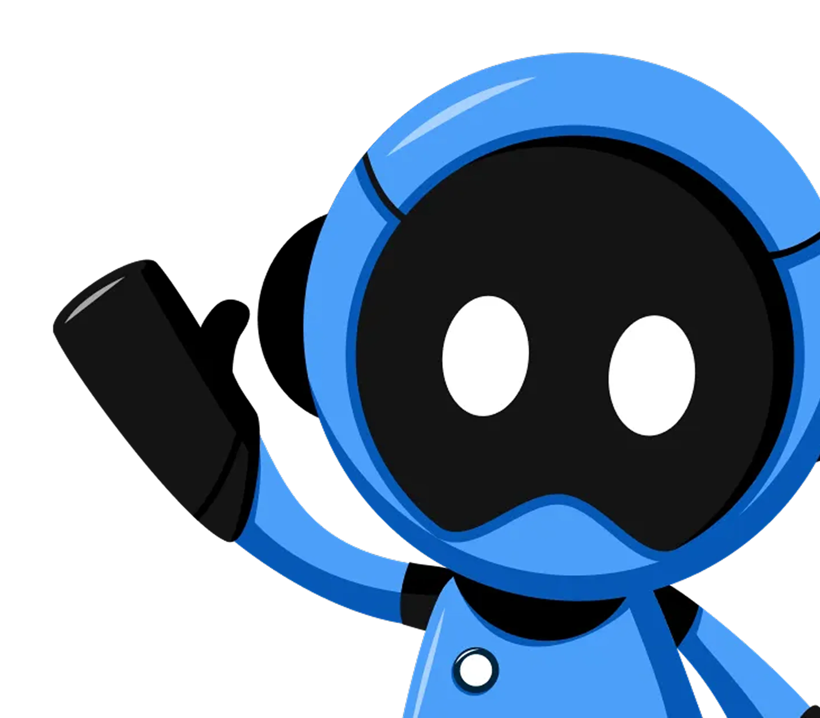
Alongside character development, we designed a complete visual identity system—including a full logo suite, color palette, iconography, and a tailored typography hierarchy. The logos were carefully constructed for flexibility across light and dark themes, ensuring clarity at all scales.
The color palette blended tech-forward confidence (NFT Navy, Sapphire) with vibrant gamification (Prize Green, Winner Pink), all tied together by a consistent flat illustration style. Typography was standardized around the Titillium Web family for digital readability and paired with a custom-drawn logotype inspired by Oxanium for the wordmark.
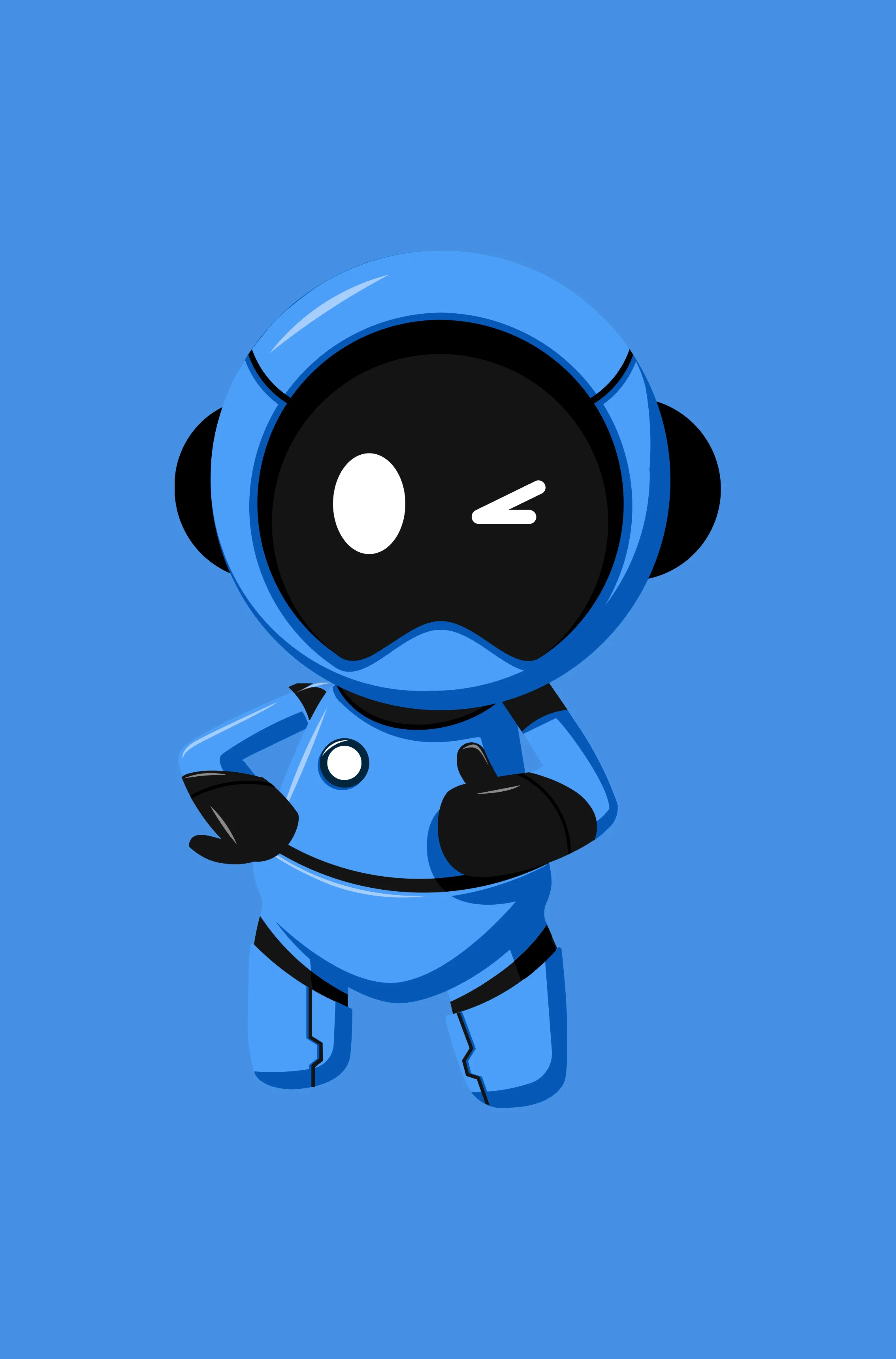
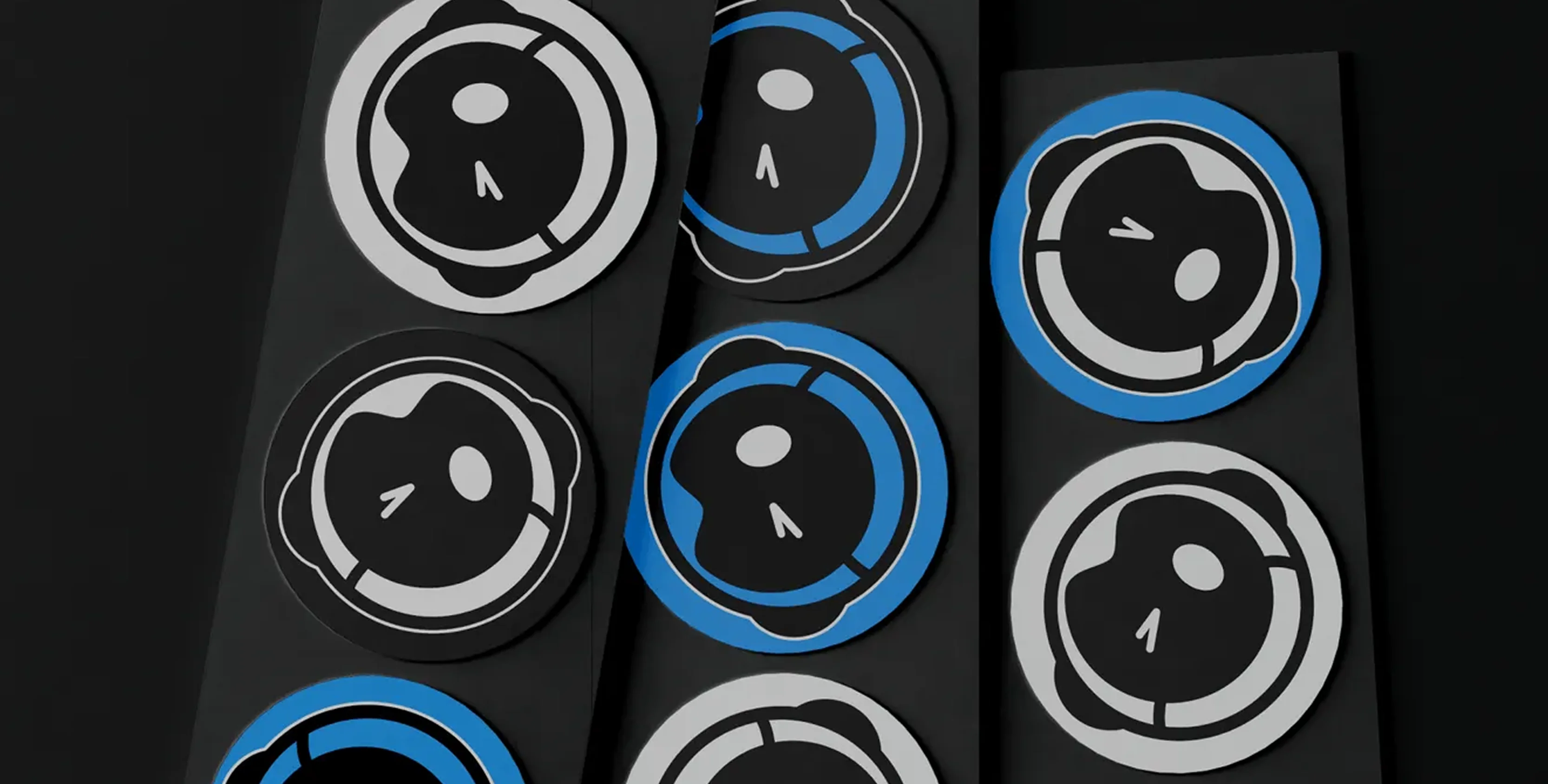
To connect brand with product, we created a comprehensive Figma UI Kit that brought all these elements into a single, usable framework for developers and designers. The kit included buttons, cards, modals, forms, and layout components—all pre-styled with Tokened’s system and ready for use in digital products.

Results & Impact
Contact Us


.webp)
.webp)


